Citadel Wealth Solutions
This client is a Financial Planning firm with a large client base of private clients who desire sound investment advice and risk management with piece of mind. The logotype was designed to reflect financial wealth creation and protection through the style of typeface, colours and the symbol which reflects both a pile of gold coins, a Citadel tower and a letter "C".

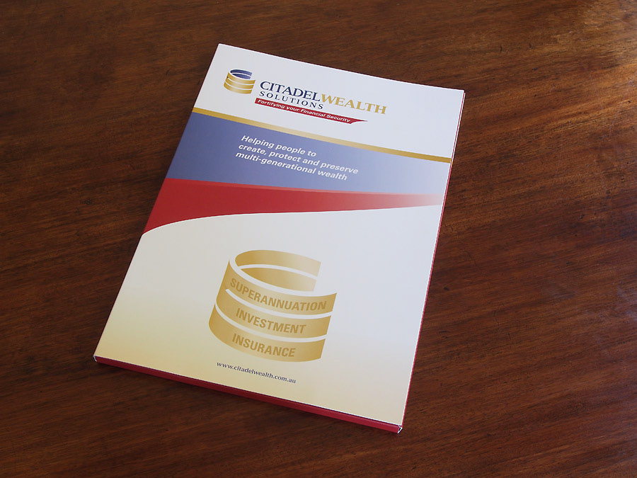
Presentation Folder outer spread
The design of the Presentation Folder was specifically required to be relaxing and abstract to appear none-threatening to their wide audience. The centre section of the cover gives a feel of looking into the future for sound financial performance.
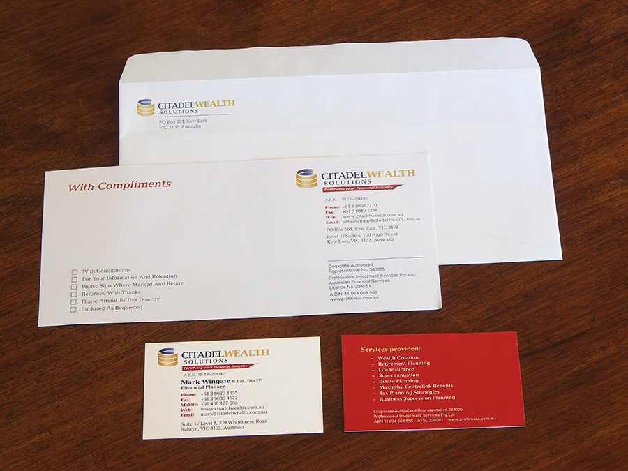
Citadel Wealth Solutions stationery
The Corporate Stationery has been designed in a combination of four colour process
and two spot colours for the envelopes.
The layout is clean, conservative and professional to suit the client audience.
and two spot colours for the envelopes.
The layout is clean, conservative and professional to suit the client audience.