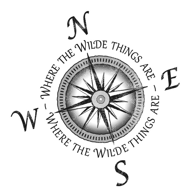
Where the Wilde Things Are
This monochromatic logo was commissioned to brand a product range of boutique T-Shirts and accessories for an online store based in Melbourne. The client's surname is Wilde, and she wanted a distressed compass with a tattoo feel to show off her clever brand name that plays on an award winning, 1970's children's book by Maurice Sendak.

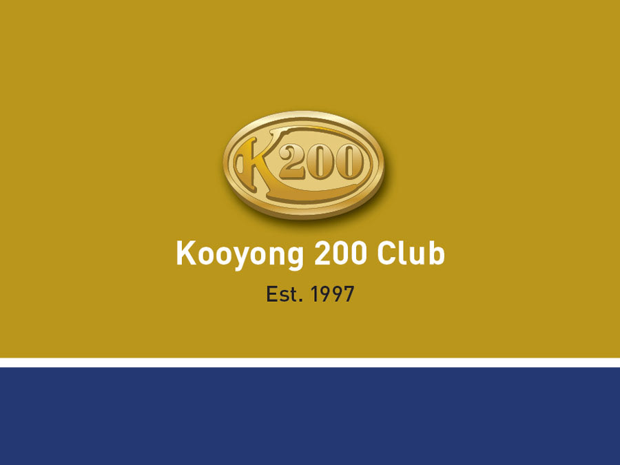
Kooyong 200 Club Logo
This vector illustration, layout and colour scheme was created for a 6 page, fold out membership brochure. It represents the small brass coloured pin badge given out to members of this group who attend inspiring events with guest political speakers from the Australian Liberal Party.
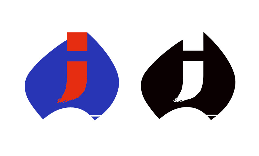
Australia - Japan Foundation Logo
My winning submission to a National Student Design competition whilst at Swinburne Institute of Technology in 1982 (Swinburne University).
The brief was to represent both Australia and Japan in the one symbol using the national colours of both countries and an emphasis on Australia. The letter j ends in a Japanese calligraphic brush stroke while the dot above forms the Gulf of Carpentaria.
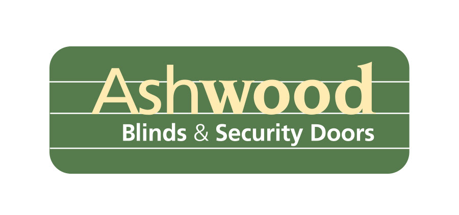
Ashwood Blinds & Security Doors
When Ashwood Bamboo Blinds expanded their product range they needed to separate their Blinds and Security Door products from the Bamboo Blinds collection. This required a subtle re-working of the original Ashwood Bamboo Blinds logo I designed, to show the new business name and not lose the long standing brand identity.
Bamboo Blinds Australia
My client then asked me to create a logo for a new business to market their Bamboo Blind range of products. The brief was to target the medium to high end blinds market, nationally across Australia, to appeal to interior designers, architects as well as residential and commercial property owners.
Citadel Wealth Solutions
The brief for this client was to design a logo that represented
wealth creation and protection at the same time.
The symbol represents a fortress-like tower, commonly found in citadels of the middle ages and the building of wealth is symbolised by gold coins stacked on each other. The symbol also looks like a 3-D letter C for Citadel.
wealth creation and protection at the same time.
The symbol represents a fortress-like tower, commonly found in citadels of the middle ages and the building of wealth is symbolised by gold coins stacked on each other. The symbol also looks like a 3-D letter C for Citadel.
Q Klean Logo
My client requested on a Crown over the letter Q to emphasise the Quality of his cleaning business. A 1950s attitude with a flowing tail on the Q suited the design perfectly.
IP Communications Logo
The design represents the idea of "building a bridge" between the research, higher and professional education communities and commercial marketing experts. The dot above the i and the empty bowl shape in the P suggest "seeds of knowledge" leading to the commercialisation of new IP.
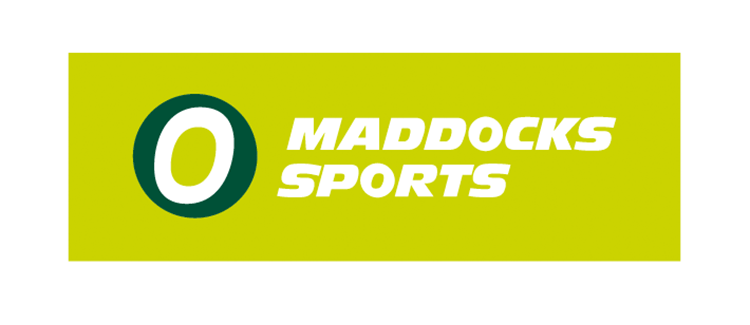
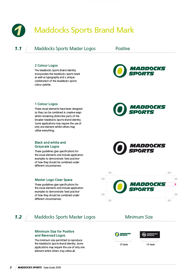
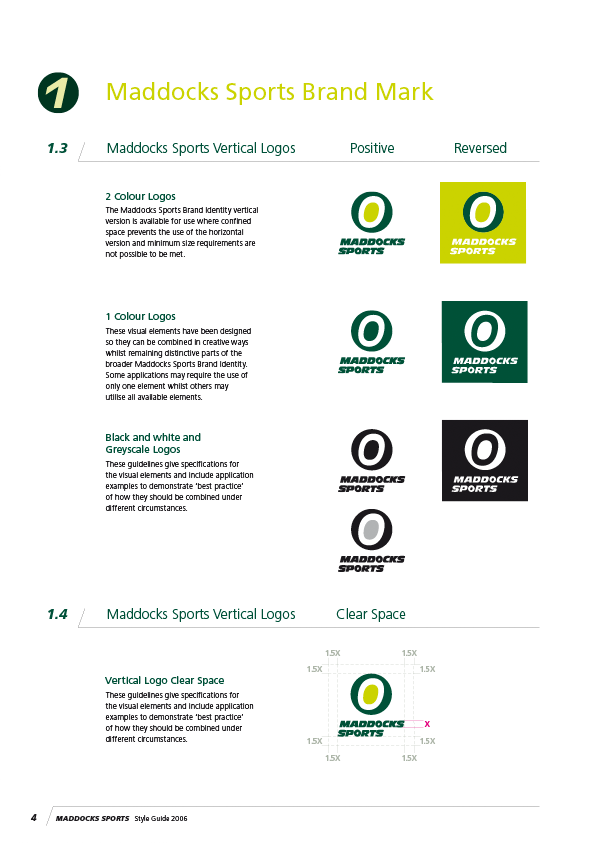
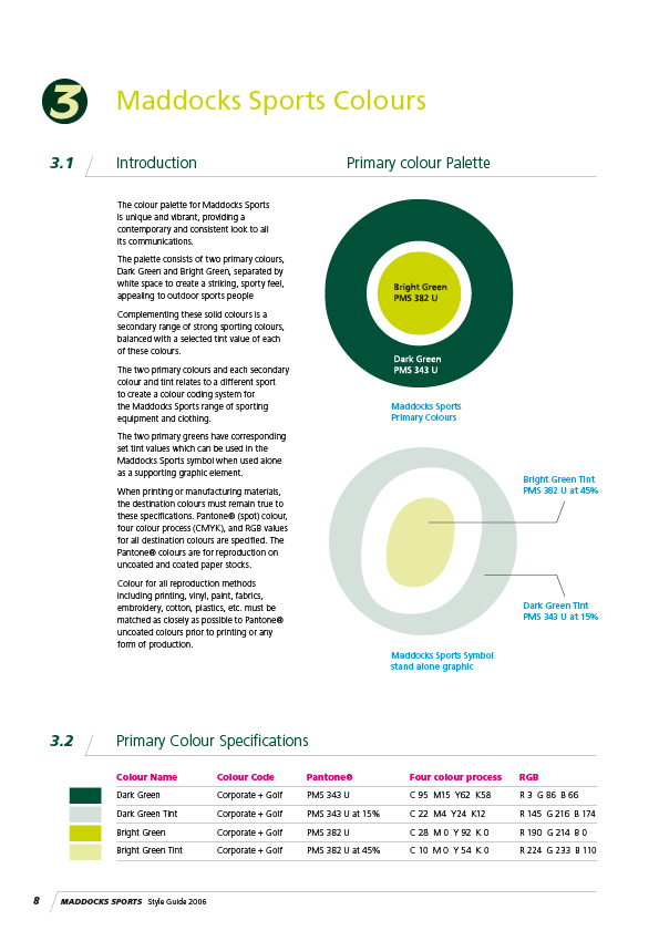
Maddocks Sports Logo + Style Guide
Below are selections from the Style Guide that displays the acceptable variants of the logo for different applications of the brand identity.
Style Guides are a valuable tool to ensure consistent use of the brand identity across different platforms when handled by different designers.
Style Guides are a valuable tool to ensure consistent use of the brand identity across different platforms when handled by different designers.
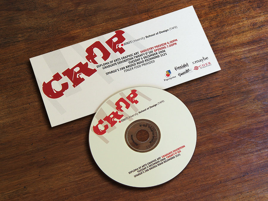
RMIT Graphic Art (TAFE) Graduate Exhibition - Logo 2006
My CROP logo design plays on the double meaning of the name; representing the latest "Crop" of final year Graphic Art graduates and the action of cropping the letter forms as if they were individual images.
This design was used for the exhibition.
This design was used for the exhibition.
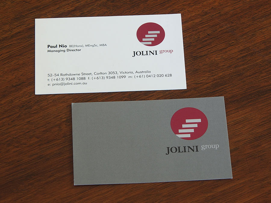
Jolini Group Logo
The Jolini Group comprised three businessmen specialising in generating venture capital for innovative entrepreneurs. The graphic inside the circle symbolises a staircase leading upward to greater heights.
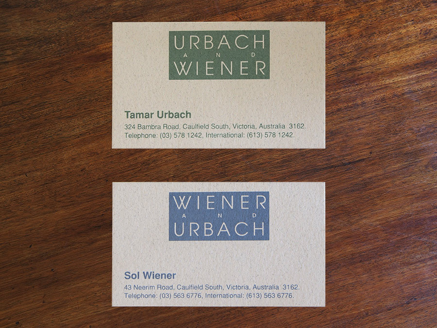
URBACH and WIENER / WIENER and URBACH
Business cards for two close friends of mine who were a couple but wanted to keep their contact details separate.
Using the same design but a simple switch of the name order and colour produced an interesting solution that kept both partners happy.
Using the same design but a simple switch of the name order and colour produced an interesting solution that kept both partners happy.

Deepdene Primary School Logo
This design features the prominent school facade, used previously in my old State school's logo. Designed in 1998, this logo is still in use today.
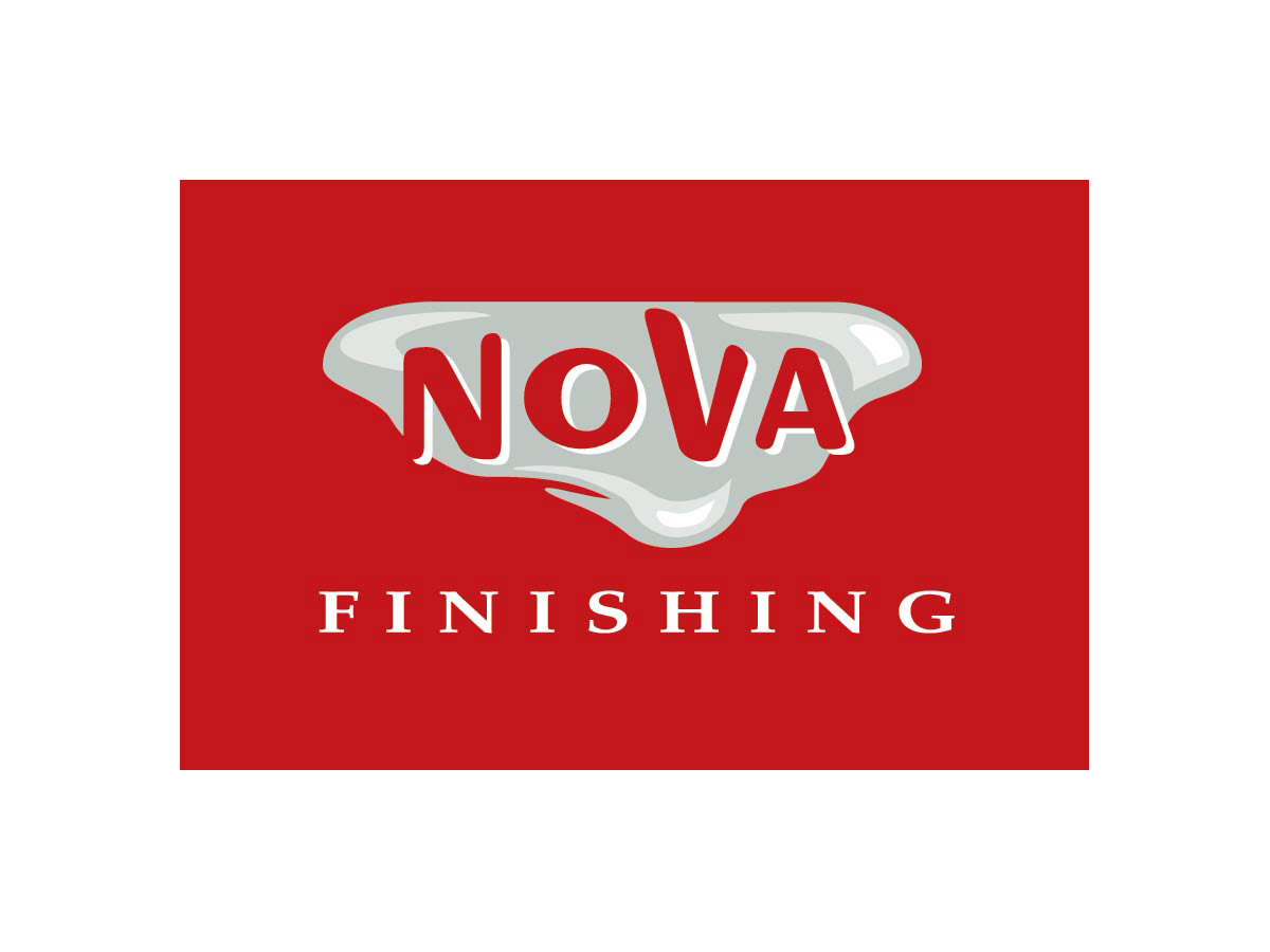
Nova Finishing Logo
This company applies high quality gloss and satin, colour co-ordinated, polyurethane coatings to kitchen cabinets, doors and other furnishings for the building industry. This logo makes a fashionable statement while capturing the tough, yet fluid nature of the application.
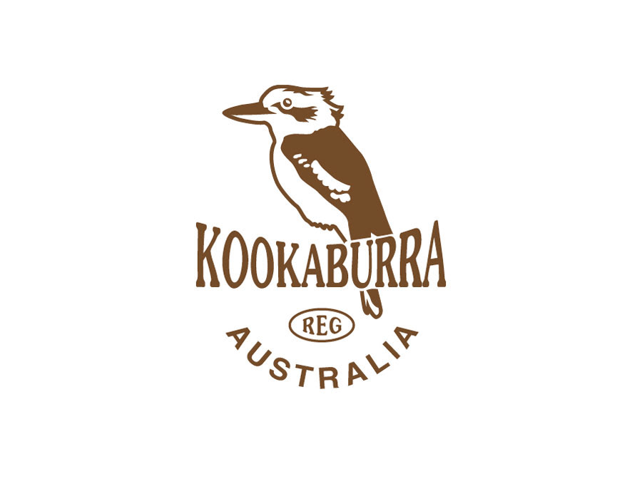
Kookaburra Australia - Bird Callers Logo
This classically Australian style logo captures the nostalgic feel of yesta-year advertising of the early 20th century with a clean, fresh interpretation. It was used on small oval shaped clear stickers printed in black and applied to tube shaped Kookaburra bird callers.
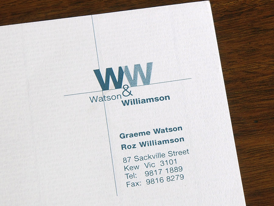
Watson & Williamson Logo
Another partnership of a business nature was requested from a couple who kept their own surnames. The design was used for their business stationery and makes an attractive ligature between the capital WWs.